Delve into the world of share price charts with this comprehensive guide tailored for beginners. Learn how to decipher complex data and make informed decisions in the stock market.
Explore the basic elements, interpret trends, understand technical indicators, and master reading candlestick patterns to elevate your trading game.
Understanding Share Price Charts
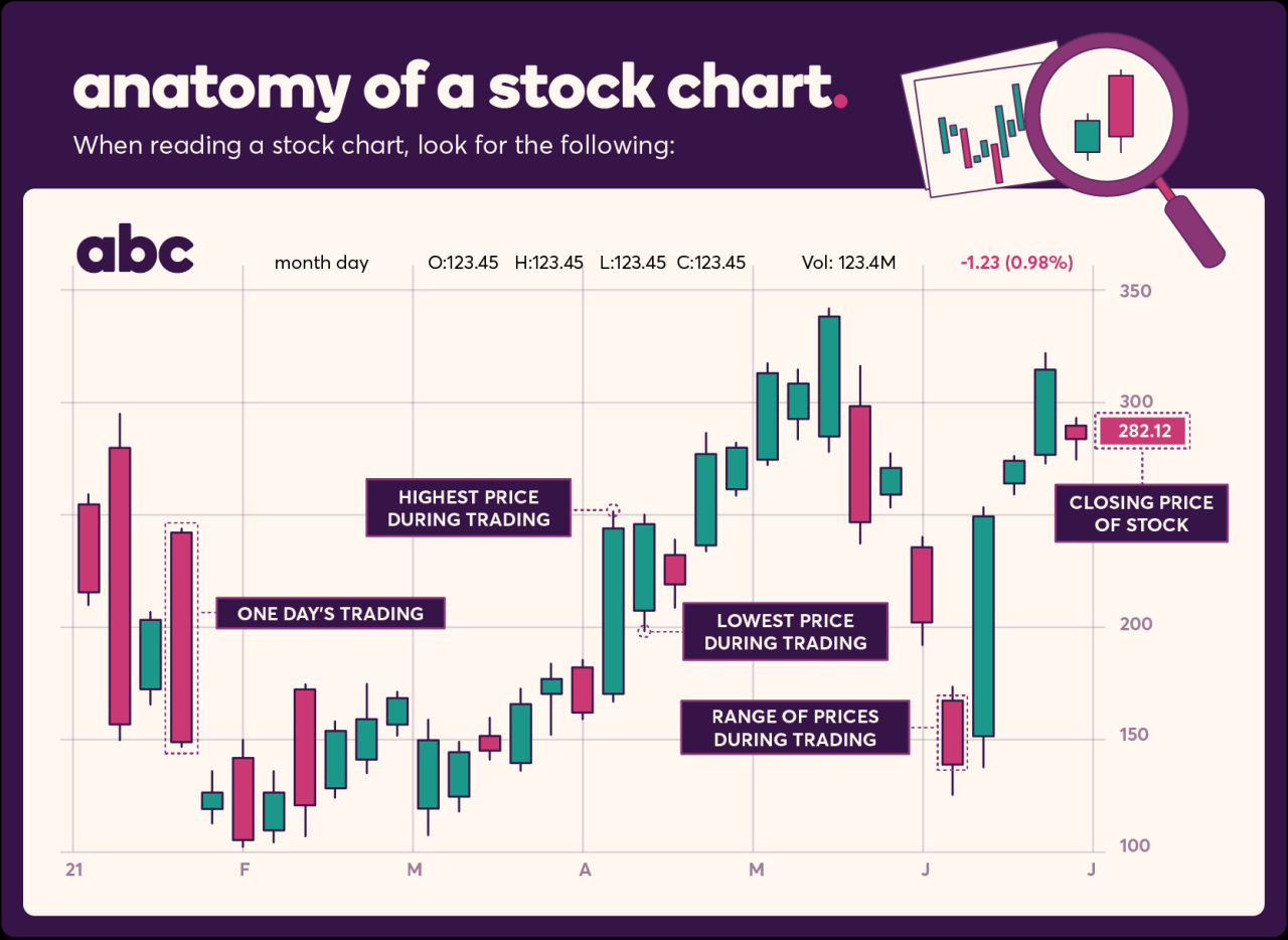
Share price charts are visual representations of a stock's price movements over a specific period of time. They are essential tools for investors to analyze and track the performance of a particular stock.
Basic Elements of a Share Price Chart
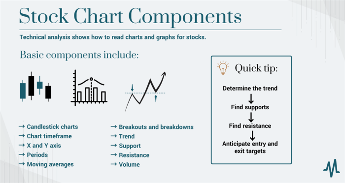
- The x-axis represents time, with the most recent data on the right and older data on the left.
- The y-axis shows the stock price, with the highest price at the top and the lowest price at the bottom.
- Candlesticks, line charts, and bar charts are commonly used to display share price data.
Types of Share Price Charts
- Candlestick Charts: Show the opening, closing, high, and low prices for a specific period.
- Line Charts: Represent the closing prices of a stock over a period, making it easier to identify trends.
- Bar Charts: Display the high, low, opening, and closing prices of a stock for a specific period.
Visual Representation of Stock Performance
Share price charts visually represent stock performance, allowing investors to analyze trends, patterns, and potential price movements. For example, an upward trend on a line chart indicates a stock's price is increasing over time.
Importance of Historical Share Price Data
Historical share price data in charts provides valuable insights into a stock's past performance, helping investors make informed decisions about buying or selling. By analyzing historical data, investors can identify patterns and trends that may repeat in the future.
Interpreting Share Price Trends
Understanding how to interpret share price trends is crucial for making informed investment decisions. By analyzing share price charts, investors can identify patterns that indicate potential future price movements.
Identifying Trends
When looking at share price charts, investors can identify trends by observing the direction in which the price is moving over time. An upward trend, also known as a bullish trend, is characterized by higher highs and higher lows. In contrast, a downward trend, or bearish trend, features lower highs and lower lows.
Recognizing these patterns can help investors determine the best time to buy or sell a stock.
Significance of Support and Resistance Levels
Support and resistance levels are key indicators in analyzing share price trends. Support levels are price points at which a stock tends to stop falling and bounces back up, indicating a potential buying opportunity. On the other hand, resistance levels are price points at which a stock struggles to move above, signaling a potential selling opportunity.
By paying attention to these levels, investors can make more strategic trading decisions.
Short-term vs. Long-term Trends
Short-term trends refer to price movements over a shorter period, such as days or weeks, while long-term trends encompass price movements over a longer period, such as months or years. Short-term trends are more volatile and can provide quick opportunities for traders, while long-term trends offer a broader view of the stock's overall performance.
It's important for investors to consider both short-term and long-term trends when analyzing share price charts.
Using Volume to Confirm Trends
Volume is a crucial indicator that can confirm share price trends. When the trading volume increases as the price moves in a certain direction, it indicates a strong trend. For example, a rising price accompanied by high trading volume suggests a bullish trend, while a falling price with high volume indicates a bearish trend.
By analyzing volume alongside price movements, investors can gain more confidence in their trend analysis.
Using Technical Indicators

When analyzing share price charts, technical indicators play a crucial role in helping traders make informed decisions. These indicators are mathematical calculations based on historical price, volume, or open interest data. They can help identify trends, momentum, volatility, and potential reversal points in the market.
Moving Averages
Moving averages are one of the most commonly used technical indicators. They help smooth out price data to identify trends over a specific period. The two main types are:
- Simple Moving Average (SMA): calculated by adding up the closing prices over a certain number of periods and dividing by that number.
- Exponential Moving Average (EMA): gives more weight to recent prices, making it more responsive to current market conditions.
By analyzing the relationship between different moving averages, traders can identify trend reversals and potential entry or exit points.
Oscillators
Oscillators are technical indicators that help identify overbought or oversold conditions in the market. They fluctuate within a specific range and can signal potential trend reversals. Some common oscillators include:
- Relative Strength Index (RSI): measures the speed and change of price movements. Values above 70 indicate overbought conditions, while values below 30 indicate oversold conditions.
- Stochastic Oscillator: compares a security's closing price to its price range over a specific period. Readings above 80 suggest overbought conditions, while readings below 20 suggest oversold conditions.
Traders use oscillators to confirm trends, identify potential entry or exit points, and manage risk in their trading strategies.
Using Technical Indicators in Trading
Traders can combine different technical indicators to make informed trading decisions. For example, they may use a combination of moving averages and oscillators to confirm trends and identify potential reversal points. By analyzing these indicators alongside other market data, traders can develop a comprehensive trading strategy that aligns with their risk tolerance and investment goals.
Reading Candlestick Patterns

Understanding candlestick patterns is crucial when analyzing share price charts. These patterns provide valuable insights into market sentiment and potential price movements.
Common Bullish and Bearish Candlestick Patterns
- Bullish Engulfing: This pattern occurs when a large bullish candle completely engulfs the previous bearish candle, signaling a potential reversal to the upside.
- Doji: A doji represents indecision in the market, with the opening and closing prices being very close or equal. It can signal a potential trend reversal.
- Bearish Harami: This pattern consists of a large bullish candle followed by a smaller bearish candle within the previous candle's range, indicating a possible downturn.
- Hammer: A hammer candlestick has a small body with a long lower shadow, suggesting a potential reversal to the upside after a downtrend.
Using Candlestick Patterns to Predict Future Price Movements
Candlestick patterns can help traders anticipate market direction based on the patterns formed. By recognizing these patterns and understanding their implications, traders can make informed decisions about buying or selling stocks.
Real-World Scenarios Influenced by Candlestick Patterns
- Example 1: A trader notices a bullish engulfing pattern forming after a prolonged downtrend and decides to enter a long position, anticipating a reversal. The stock price indeed reverses, resulting in a profitable trade.
- Example 2: A bearish harami pattern appears at a key resistance level, prompting a trader to sell their position to avoid potential losses. The stock price subsequently drops, validating the decision.
Final Review
In conclusion, mastering the art of reading share price charts is a crucial skill for any budding investor. By understanding the nuances of chart analysis, you can navigate the stock market with confidence and precision.
Essential Questionnaire
What are the basic elements of a share price chart?
The basic elements include the price scale, time scale, and various data points such as open, high, low, and close prices.
How can moving averages help identify trends in share price charts?
Moving averages smooth out price data to identify trends over a specific period, making it easier to spot potential reversal points.
What is the significance of support and resistance levels in analyzing share price trends?
Support levels indicate where a stock price may stop falling and bounce back, while resistance levels show where it might stop rising and reverse.
How do candlestick patterns help in predicting future price movements?
Candlestick patterns provide visual cues about market sentiment, helping traders anticipate potential price movements based on historical patterns.


